Design & Artwork
Davarni Artwork Requirements
There are 2 types of artwork, Rasterised Artwork and Vectorised Artwork
Rasterised Artwork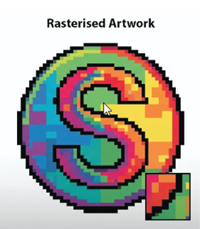
A rasterised image is like a picture built entirely out of tiny, colored square bricks. These bricks are called pixels. When you are close to the picture, it looks smooth, its like building a picture with very small blocks called pixels.
The Problem: If you want to make a small raster picture bigger, you can't just stretch it. To make it bigger, you have to add more bricks. If the computer tries to guess where the new bricks go, the edges get blurry and blocky. This is called pixelation, and it makes your artwork look fuzzy.
You can see the example opposite where the picture blown up is made from tiny blocks or pixels which cant be enlarged.
Rasterised artwork formats are jpg png gif tiff or bmp files.
Vectorised Artwork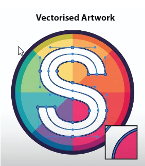
A vector image doesn't use bricks. It uses math instructions. Instead of remembering every single brick, it remembers rules like "Draw a perfect curve between Point A and Point B."
The Solution: Because it’s a rule, you can make a tiny vector drawing as large as a house, and it will never get blurry. The computer just redraws the path based on the simple math. It always stays perfectly sharp and crisp.
As in the example opposite, you can clearly see that the picture is a lot smoother and can be blown up to the size of a bus if needed without loosing any quality at all.
Vectorised artwork formats are ai eps or pdf files.
If we art printing as part of your production process, we need to use a vectorised format, especially if it is a multiple colour logo. With a vector, we are able to click on the logo and “ungroup” the colours and seperate them so each segment becomes its own part of the logo.
With rasterised logos, it is impossible to “ungroup” the logo as it is one mass of pixels.
Pantone Matching System
Pantone Matching System or PMS in simple terms, it is a standardised, universal color-matching system used across the printing, design, and manufacturing industries to make sure colors look exactly the same no matter who prints them or where they are produced.
The Problem it Solves
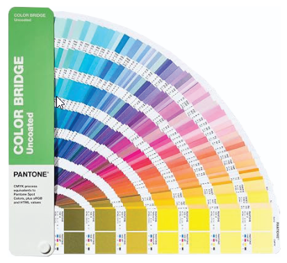
If you tell a printer to print "royal blue," one printer might use slightly more purple and another might use more cyan, resulting in two completely different shades. With PMS, every shade has a specific, universally recognized number (like "Pantone 286 C").
The Recipe Book
Pantone creates standardised ink mixing guides (often called color swatch books). When a designer specifies a PMS number, the printer follows a precise ink formula to mix those exact pigments, guaranteeing color consistency.
Download your Pantone Colour Chart hereSpot Colours
PMS uses what are called spot colors (or solid colors), meaning the ink is mixed specially before it goes on the press, rather than being built out of tiny dots of Cyan, Magenta, Yellow, and Key/Black (CMYK) like a standard office or photo printer.
PMS vs CMYK
When preparing artwork or logos for printing, we will often run into two main color modes:
PMS (Pantone)
Best for consistency and branding. If a company has an exact corporate logo color that must look identical across business cards, t-shirts, signs, and promotional merchandise, they use a PMS color.
CMYK
Standard four-color process printing (used for full-color brochures, flyers, or photo prints). It blends four ink channels to approximate colors, which can sometimes lead to slight color shifts depending on the printer. (This is why suppliers often ask for vector art in CMYK or spot colors to avoid unexpected shifts!)
Fonts
There may be a particular font that you prefer for printing purposes, we are happy to print any preferred font you would like.
Art Approval
In all cases, you will receive a full pre production artwork layout to approve prior to the printing of any products or garment. This ensures that all colours are checked including spelling position and overall design.